Shear rate chart
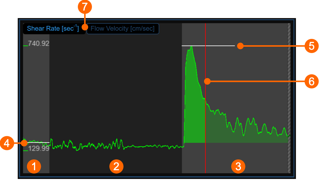
The chart shows the trend of the time averaged positive Shear Rate (or the time averaged positive Flow Velocity, according to selector (7)) during the examination. The chart is divided into three or two parts, according to the study modality. You have basal (1), ischemia (2) and vasodilation (3) intervals in FMD; ischemia is missing in vasodilation modality.
In the chart, two cursors are present: the first one (4) is placed at the baseline value; the second one (5) is placed at the maximum value in vasodilation. A third cursors (6) is shown at the time value corresponding to the maximum value of the diameter when the same cursor is selected in the Mean diameter chart . Cardiovascular Suite places the cursors at the position automatically computed at the end of the analysis. You can manually place these values if you see that some outliers have affected the automatic analysis.
These values are shown in the Results panel.
Graph cursors
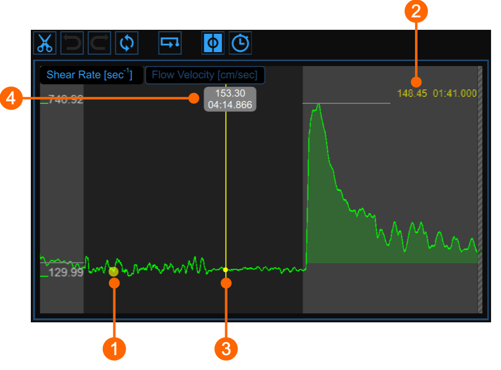
As shown in the following figure, the Cursor ![]() button at the bottom of the Mean diameter chart activates a cursor (1) on the Shear Rate chart that shows the current time position on the graph according to the images shown in the Video window. The coordinates (shear rate value in s-1 and time value in the format minutes:seconds.milliseconds) of the cursor are dynamically updated and shown in (2). When the Cursor button is active, it is also possible to know the coordinates of an exact point in the graph; it is only needed to hover over the chart and a second cursor (3) is displayed. It follows the mouse movements and the exact coordinates of the point are shown in the label (4) (shear rate value is expressed in s-1 and the time value has the format minutes:seconds.milliseconds).
button at the bottom of the Mean diameter chart activates a cursor (1) on the Shear Rate chart that shows the current time position on the graph according to the images shown in the Video window. The coordinates (shear rate value in s-1 and time value in the format minutes:seconds.milliseconds) of the cursor are dynamically updated and shown in (2). When the Cursor button is active, it is also possible to know the coordinates of an exact point in the graph; it is only needed to hover over the chart and a second cursor (3) is displayed. It follows the mouse movements and the exact coordinates of the point are shown in the label (4) (shear rate value is expressed in s-1 and the time value has the format minutes:seconds.milliseconds).