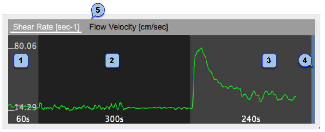
The graph shows the trend of eater the time averaged positive Shear Rate or the time averaged positive Flow Velocity during the examination. You can switch between the two view by the selector (5).
The chart is divided into parts in a similar manner to the Mean Diameter chart.
NOTE: the chart is enabled in the Doppler Panel.